
Viva Tacos
Reimagining the future of digital ordering for food trucks
Overview
I completed this project for the Google UX Certificate. Viva Tacos is a fictional taco truck business located in the suburbs of a metropolitan area. Their goal is to bring authentic Mexican flavors and foods with healthy alternatives to their community, targeting customers that need meals on the go. I completed multiple rounds of wireframing, prototyping, and user testing, delivering a high-fidelity prototype with a full design system.
Timeline
Sept 2022 - Jan 2023
(4 months)
Role
UX Designer & Researcher
Team
Individual
Type
Student Project
The Problem
Busy working professionals and students either lack time to prepare meals or want to use their free time on other activities. How can we design an app for Viva Tacos that allows customers to quickly customize and place orders in advance?
User research summary
I conducted simulated interviews using user bios to understand the users I’m designing for and their needs. A primary user group identified was busy working professionals who don’t want to spend time getting meals.
This user group disputed my initial assumptions about Viva Tacos’ customers, which assumed a majority younger demographic. From examining their responses, I learned that users ordered out not only because of a lack of time but also because they prioritized personal interests.
Major pain points:


User personas
To represent the user bios, I created two personas:
Ishaan, a busy working professional, needs quick and healthy food options because he has little free time and wants to spend most of it on his hobbies.
Sofía, a recent college graduate, needs an accessible ordering solution for her favorite taco truck to overcome language barriers when ordering ahead online.

Ishaan’s user journey
Mapping Ishaan’s user journey revealed how helpful it would be for users to have access to a dedicated Viva Tacos app.

Creating paper wireframes
Iterating on each screen of the app ensured that the elements that made it to the final version were best-suited to address user needs. For the item window, I chose to organize information to be easy to skim from the top down.

Low-fidelity prototype
I connected the primary user flow of customizing and placing an order to test in usability studies. I added secondary flows of logging in and viewing settings to make the overall experience more seamless.
Usability study findings
I conducted two rounds of usability studies with 8 participants from my personal network, including both working adults and students. I used affinity mapping techniques to organize the data and identify problem areas.


Findings from the first study guided designs from wireframes to mockups. The second study used a high-fidelity prototype and revealed aspects of the mockup that needed refining.

Design changes
1. Removing Unnecessary Complexities
Initial designs had a horizontal navigation bar for menu categories, but I revised this because the feature was unnecessarily complex for the limited menu options.
Users also wanted quick access to popular items and the option to edit pickup and delivery before ordering.

2. Simplified Cart
Users wanted the ability to change item quantities on the cart page. I also restructured item cards so all cost amounts would be right-aligned for better readability.
Lastly, I simplified the content on this page to avoid overwhelming users. The promotion code and discount fields were integrated into the checkout flow to better match users’ mental models.

3. Improved Checkout Flow
The first usability study revealed confusion with navigating the checkout flow. To make the process more linear, I removed the top navigation bar and added a progress indicator. I also added more emphasis to the CTA button.

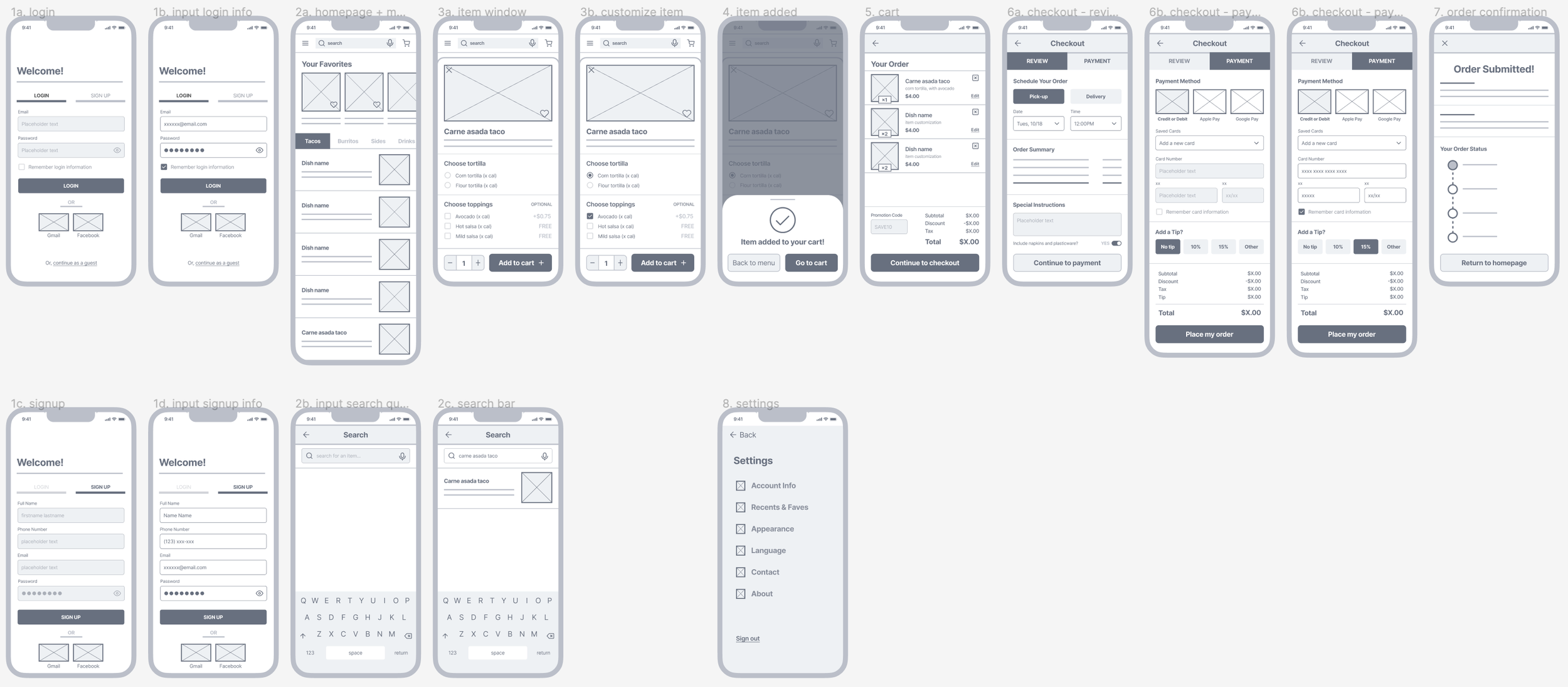
Final design

Design system

Accessibility considerations

Reflections
This was the first end-to-end UX project that I completed from conceptual designs to a high-fidelity prototype! I’m proud of the final product, but more importantly, am grateful to have gone through an entire UX process so I can see what it’s actually like. Some lessons that I learned from this project:
Consider accessibility every step of the way. Although I didn't directly interact with users that had accessibility needs, working with personas that presented challenges like visual impairments and language barriers allowed me to explore accessibility tools and understand the significance of integrating feedback from users with diverse abilities. Going forward, I recognize the importance of being inclusive early on in the design process to better address accessibility and enhance overall usability and satisfaction for all users.
Prioritize your time and iterate quickly. There were several times during the project when I worked longer than intended on certain research or visual elements, but I quickly realized the necessity of maintaining progress and meeting project milestones. Instead of striving for perfection in the initial stages only to make significant changes later, I learned to embrace iterative design. Generating ideas quickly, testing them, and iterating based on feedback led to more efficient and effective design outcomes. In the future, I’ll also work on actively seeking feedback from team members, mentors, and potential users to provide me with a well-rounded perspective about the project's direction.